

Table of Contents
- Why the Order of Design Decisions Matters
- Mistake 1: Buying Furniture Before You Have a Floor Plan
- Mistake 2: Choosing Paint Colour First
- Mistake 3: Getting Furniture Scale and Proportion Wrong
- Mistake 4: Pushing Furniture Against the Walls
- Mistake 5: Using an Undersized Rug
- Mistake 6: Relying on One Overhead Light
- Mistake 7: Hanging Artwork at the Wrong Height
- Mistake 8: Mixing Styles Without a Cohesion Rule
- Mistake 9: Ignoring Traffic Flow and Room Function
- Mistake 10: Designing for Instagram, Not for Living
- Cost and Impact Comparison Table
- Summary and Discussion
- FAQ
Why the Order of Design Decisions Matters
Most rooms go wrong in the first fifteen minutes of planning. You fall in love with a sofa, or you find a paint colour, and you build everything else around that single decision. That’s the real mistake: not any individual choice, but the sequence.
Professional designers work from structure outward: floor plan, then light sources, then large-scale furniture, then colour, then accessories. Studios like Alix Helps Interiors apply this sequence on every project precisely because skipping any step forces corrections later. Every item on this list is a symptom of skipping a step in that sequence.
Fix the sequence, and many of these mistakes never happen.
Mistake 1: Buying Furniture Before You Have a Floor Plan
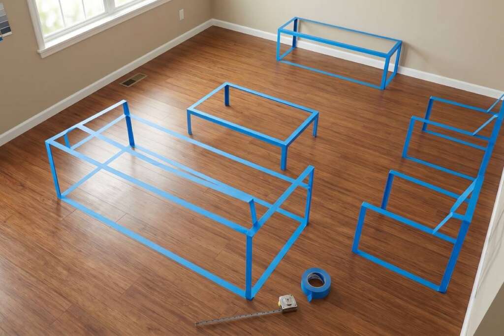
This is the mistake that causes the most expensive downstream problems. You buy a sofa you love in the showroom. It arrives. It blocks the walkway to the balcony, or it swallows the room entirely, or it sits so far from the TV that the room no longer functions as a lounge.
According to the National Association of Realtors‘ 2023 Profile of Home Staging, 81% of buyer’s agents reported that staged homes (which systematically correct layout and scale errors) made it significantly easier for buyers to visualise the property as their own. Poor furniture placement is legible to everyone, even if they can’t name it.
The fix:
Before purchasing a single piece of furniture, tape out dimensions on the floor with painter’s tape. Map traffic pathways. Identify focal points. This costs nothing and eliminates the most expensive class of design error.
Mistake 2: Choosing Paint Colour First
Paint is the most reversible element in any room. It’s also the one most people choose first, which turns it into a constraint instead of a complement.
Walls cover the largest surface area in a room. When you choose paint before furniture, textiles, and flooring, you force every subsequent purchase to work around a fixed colour. That’s the wrong direction.
The fix:
Choose paint last, or second-to-last. Finalise your rug, sofa, and major textile colours first. Then pull a wall colour from those pieces. The room reads as intentionally coordinated rather than assembled around a lucky guess.
A secondary error inside this one: testing paint swatches only during daylight. Artificial light at night shifts warm tones to orange and cool tones to grey. Always view swatches under both conditions before committing.
The timing problem compounds when you haven’t yet decided between wallpaper vs paint, since each finish behaves differently under artificial light and changes how a colour reads on the wall.
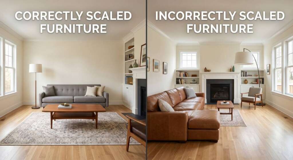
Mistake 3: Getting Furniture Scale and Proportion Wrong
Scale errors are the most immediately visible problem in any room, yet they’re the hardest for non-designers to diagnose. The room “feels off” but the cause is not obvious.
The most common version: furniture that is too small for the room. This happens because showrooms are large and furniture looks appropriately sized in them. In a standard Australian living room of 16–20 square metres, that same piece reads as floating, unanchored, and undersized.
The fix:
Apply the visual weight rule. Every large piece needs counterbalancing. A low-profile sofa needs a tall bookcase or a substantial floor lamp nearby. A round dining table in a rectangular room needs rectangular art or a long credenza to reintroduce linearity. The room’s visual tensions need to be balanced, not eliminated.
Specific rule of thumb: sofas should occupy roughly 2/3 of the wall they face. Dining tables should leave a minimum of 90cm clearance on all sides for chairs to be pulled out and guests to walk behind them.
Mistake 4: Pushing Furniture Against the Walls
This is the instinctive choice when a room feels small: move everything to the perimeter to “create space” in the centre. It does the opposite.
When furniture lines the walls, the centre of the room becomes dead space. Conversation across a room-width gap is uncomfortable. The room reads as a waiting room, not a living space.
The fix:
Float your furniture. Pull seating pieces away from the walls by 30–60cm. Group them around a central point, usually a coffee table or rug. This creates a defined conversation zone, which makes the room feel more intentional and paradoxically larger.
For smaller rooms, even pulling a sofa 15cm from the wall is enough to break the waiting-room effect and create the illusion of a designed space.
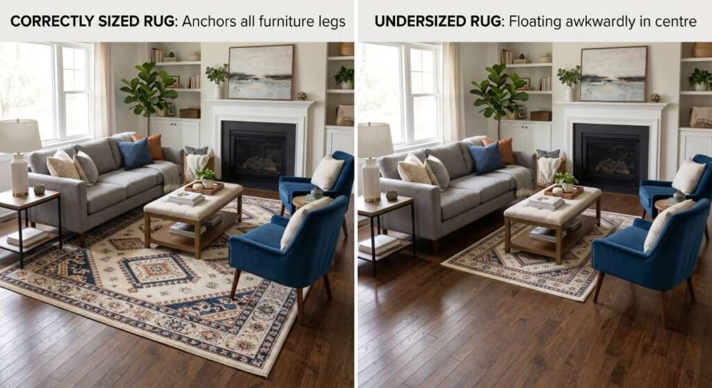
Mistake 5: Using an Undersized Rug
An undersized rug is one of the most common and most correctable interior design mistakes. It makes furniture look untethered, and the room look unfinished, even when everything else is well-chosen.
The rule most designers use: in a living room, all four legs of the sofa should sit on the rug, or at a minimum, the front two legs. In a bedroom, the rug should extend at least 60cm beyond the sides and foot of the bed.
The fix:
Before purchasing a rug, lay newspaper or cardboard sheets across the intended rug area and photograph it from a standing position. The correct size is almost always larger than your first instinct. Standard rug sizes in the 160x230cm range are often too small for living rooms designed around a standard three-seater sofa.
A rug that is too small creates two problems: it looks like a decorative accent rather than a zone anchor, and it draws attention to itself for the wrong reason.
Beyond anchoring furniture, how rugs define zones and add brightness is a technique that applies even in rooms where natural light is limited or the colour palette is predominantly neutral.
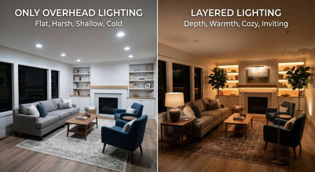
Mistake 6: Relying on One Overhead Light
Single-source overhead lighting is the default in most homes and the single biggest contributor to rooms that feel flat, cold, or clinical. A ceiling fixture lights a room the same way a flashlight lights a cave: technically functional, visually harsh.
Professional lighting design uses three layers:
Ambient light
Provides general illumination. This is your ceiling fixture or downlights. It should not be the only layer.
Task lighting
Targets specific functions: a reading lamp beside a chair, pendants above a dining table, and under-cabinet lights in a kitchen. Task lights serve practical needs and add visual depth.
Accent lighting
Highlights architecture or objects: uplights behind plants, picture lights above art, strip lighting inside a bookcase. Accent lights create the shadows and contrast that make a room feel dimensional.
The fix:
Every room needs at least two of these three layers, and living rooms and bedrooms benefit from all three. Floor lamps and table lamps are the lowest-cost way to add depth to a room that currently relies on overhead lighting. A single $150 floor lamp in the corner of a room can transform how the entire space reads at night.
Mistake 7: Hanging Artwork at the Wrong Height
Artwork hung too high is nearly universal in residential spaces. It happens because people instinctively treat wall space like vertical territory to be filled from eye level upward. The effect is a room where art looks like it is escaping the furniture below it.
The industry standard: the centre of a piece (or a gallery grouping) should sit at approximately 145–152cm from the floor. This places art at average eye level and keeps it visually connected to the furniture beneath it.
The fix:
Measure 150cm up from the floor and make a light pencil mark. That is your centre point. Work outward from there. For art hung above a sofa, the bottom edge of the piece should sit 15–25cm above the sofa’s back. If the gap is larger than that, the art and the furniture read as separate, unrelated objects.
Gallery walls follow the same rule: treat the grouping as a single object and centre the entire arrangement at 150cm.
Mistake 8: Mixing Styles Without a Cohesion Rule
Style eclecticism is not a mistake. Mixing styles without a rule is Rooms that feel chaotic are almost always rooms where items were purchased individually, each liked in isolation, but never evaluated for how they work as a system.
The practical rule most professional designers apply: 70/30. Approximately 70% of the room’s visual identity should belong to one style or tone family, with 30% introducing contrast or character. A predominantly mid-century modern room can absorb contemporary or rustic elements if they occupy the minority share.
The fix:
Before any purchase, identify the primary style of your space. Then assess each new piece against the question: Does this belong to the 70% or the 30%? If it belongs to neither, it does not belong in the room. This applies to colour as much as style.
A useful secondary test: photograph the room from the doorway. The composition should read as cohesive from that distance. Individual pieces that are attractive up close but disrupt the room-level composition are net negatives.
Mistake 9: Ignoring Traffic Flow and Room Function
A room that looks good in photographs but is frustrating to live in has failed at its primary job. Traffic flow is the most undervalued variable in residential design.
Every room has natural pathways: the route from the entrance to the seating area, from the sofa to the kitchen, from the bedroom door to the wardrobe. Furniture placed across these pathways forces occupants to navigate around it every time, which creates low-level frustration that accumulates.
The fix:
Identify the two or three most frequent movement paths in each room. Those pathways need a minimum clear width of 90cm for single-person traffic, and 120cm where two people pass regularly (hallways, kitchen work areas, dining room perimeters).
If furniture is currently blocking those paths, the issue is not the furniture: it is the floor plan. Rearranging without correcting the floor plan creates a different set of obstructions.
Mistake 10: Designing for Instagram, Not for Living
This is the mistake that increased dramatically after 2015 and accounts for a distinct class of rooms that look extraordinary in photographs and feel uncomfortable to occupy. All-white rooms with no tactile warmth. Rooms built around a single statement piece. Furniture chosen for visual impact rather than physical comfort.
The test is simple: spend four hours in the room. Cook, watch TV, have a conversation, try to work. If the room actively resists everyday use, the design has prioritised aesthetics over function.
The fix:
Every design decision should pass a dual test: does it look right AND does it work right? Comfort in seating, acoustic absorption in hard-surfaced rooms, and storage for the things the room actually needs to contain. These are not compromises on design quality. They are of design quality.
Textiles play a structural role here. Rugs, cushions, curtains, and throws absorb sound, add tactile warmth, and make a room feel occupied rather than staged. Hard-surfaced rooms with no textiles are aesthetically striking and practically exhausting.
Cost and Impact Comparison Table
| Mistake | Estimated Cost to Fix (AUD) | Prevention Difficulty | Design Impact |
| No floor plan before purchasing | $300–$5,000+ (replacement/return fees) | Low (tape and measure) | Very High |
| Paint chosen first | $200–$1,200 (repaint) | Low (delay paint selection) | High |
| Wrong furniture scale | $500–$6,000+ (replacement) | Low (measure before buying) | Very High |
| Furniture against the walls | $0 (rearrange) | Low | High |
| Undersized rug | $150–$900 (replacement) | Low (buy larger) | Moderate |
| Single overhead light | $80–$800 (add floor/table lamps) | Low (add lamps) | High |
| Artwork too high | $0 (rehang) | Low | Moderate |
| No cohesion rule | $500–$4,000 (edit and replace) | Medium (define style first) | High |
| Poor traffic flow | $0–$2,000 (rearrange or replace) | Medium (floor plan review) | Very High |
| Form over function | $1,000–$8,000+ (redesign) | Medium (dual-use test) | Very High |
Summary and Discussion
- The most expensive interior design mistakes are not decorating errors. They are sequencing errors: buying before planning, choosing colour before materials, prioritising appearance before function.
- Most of these mistakes cost nothing to prevent and hundreds to thousands to fix after the fact. The entire list reduces to one rule: plan first, buy second.
- Lighting and rug sizing are the two fastest, lowest-cost improvements for rooms that currently feel flat or unfinished.
Discussion question: Which of these mistakes have you already made in your home, and what did fixing it (or living with it) actually cost you?